Maison Bleu
Conceptualized a patisserie that offers an inventive, quirky perspective on traditional French pastries and coffee.
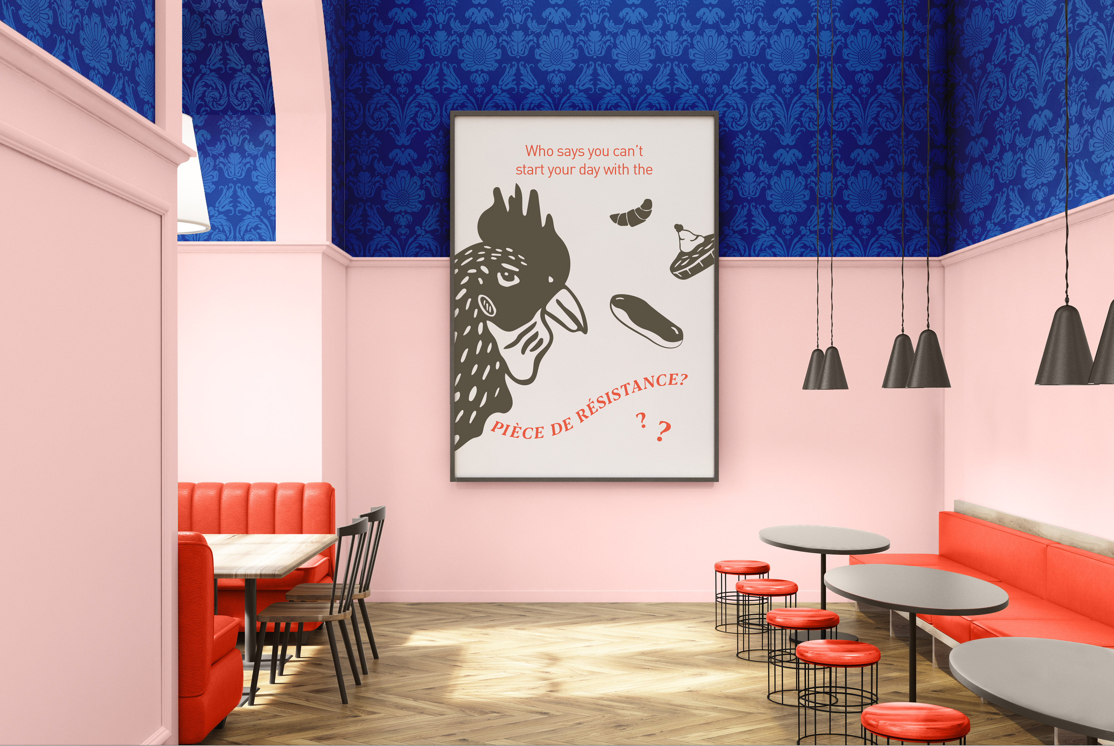
Maison Bleu goes beyond being a premium pastries and coffee retailer— it's a place for people to gather and appreciate some of the greatest parts of French culture. Whether it be a meeting space for the French-American community, or the American, pastry fiends of Minneapolis.
ROLE: Branding, packaging design, illustration, naming, messaging, interior design, and product photography.

My initial challenge was to design a pastry box in a way that reflects the artful taste and originality of quality pastries. Additionally, my personal goal was to explore my own French-American identity and create a welcoming space for people to learn about and appreciate French culture. Maison Bleu is a bold, fun and welcoming patisserie that incorporates traditional french design and pastries with quirky, illustrative elements referencing the French countryside. It juxtaposes formal pattern and typographic elements with bold color and playful illustrations to establish it's own unique identity.
Process & Inspiration
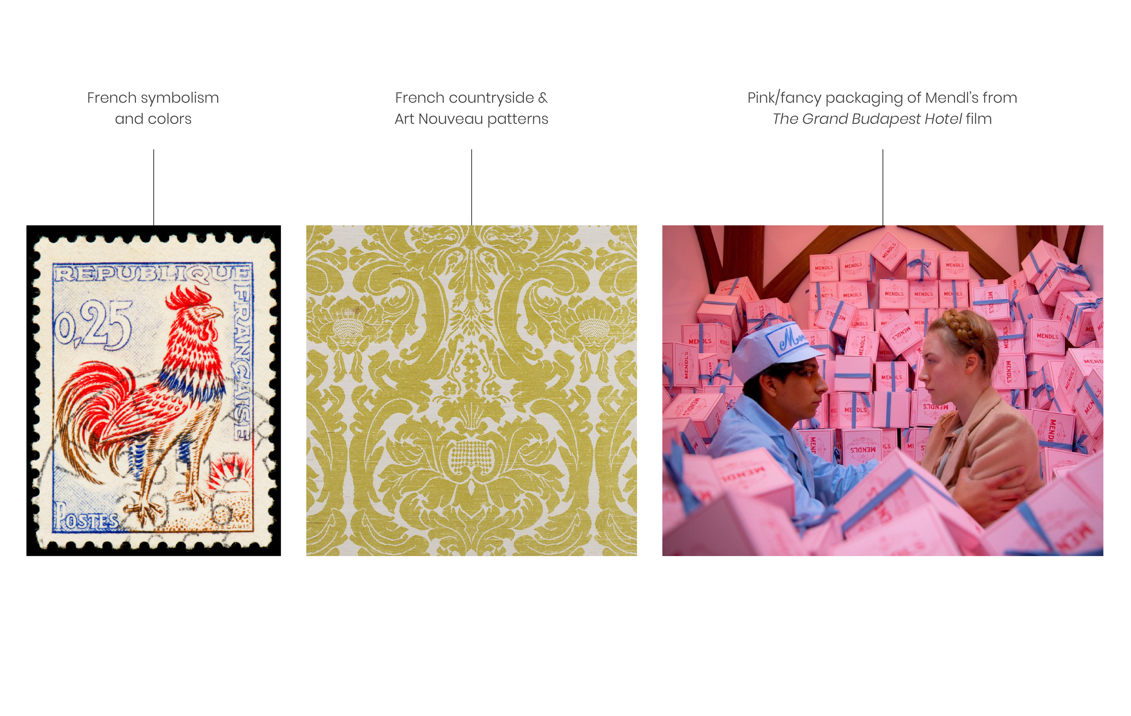
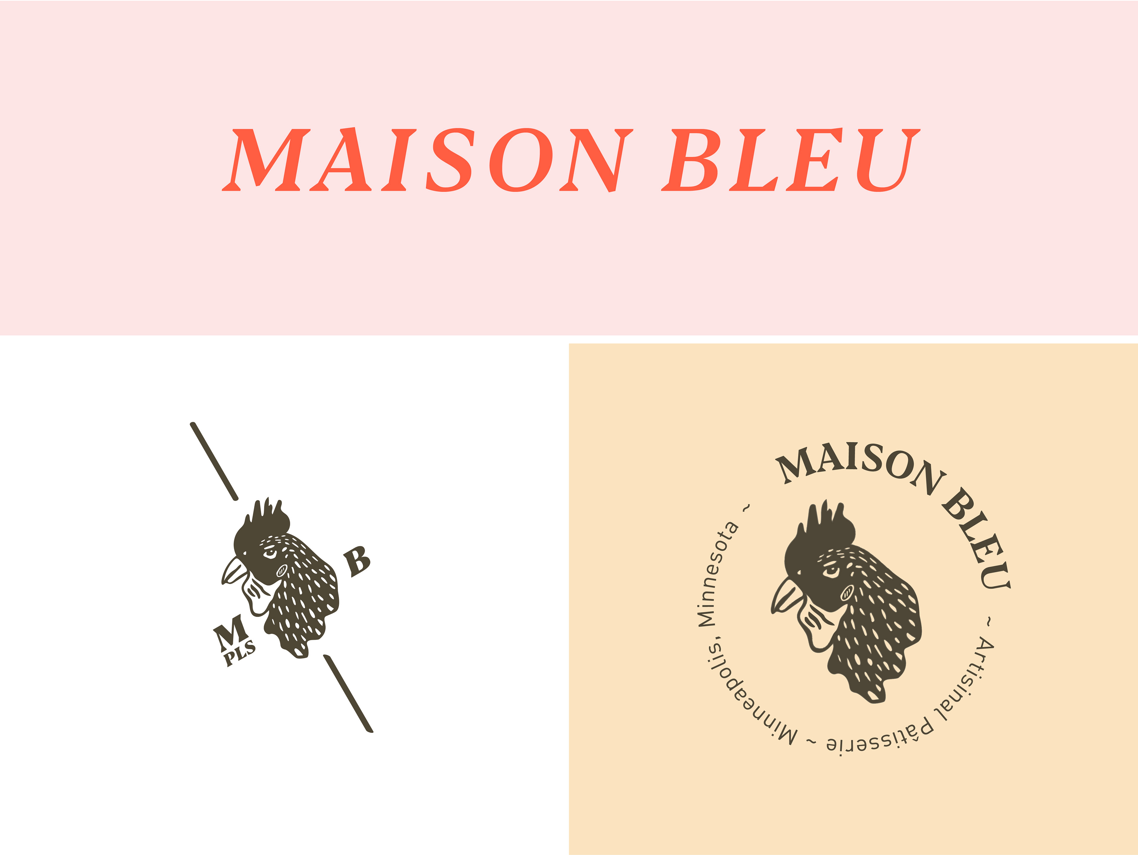
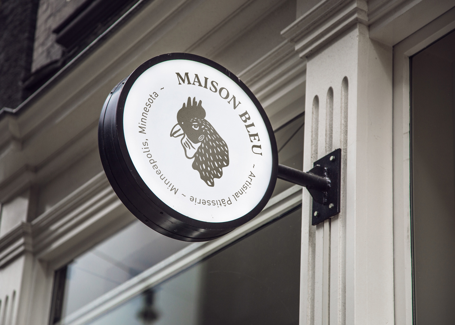
Stemming from peasant origins, the rooster, a proud, opinionated, courageous, and prolific character, strongly represents French ideals. For the logo, I decided to reference this, as the rooster connects both to French culture and to the farm as an ingredient source for pastries. The use of juxtaposing elements— combining elegant, formal type and patterns with uncanny illustrations of roosters and pastries, pushes the brand beyond the traditional. The logo lockups lend themselves to a variety of formats, and maintain this brutalist style.
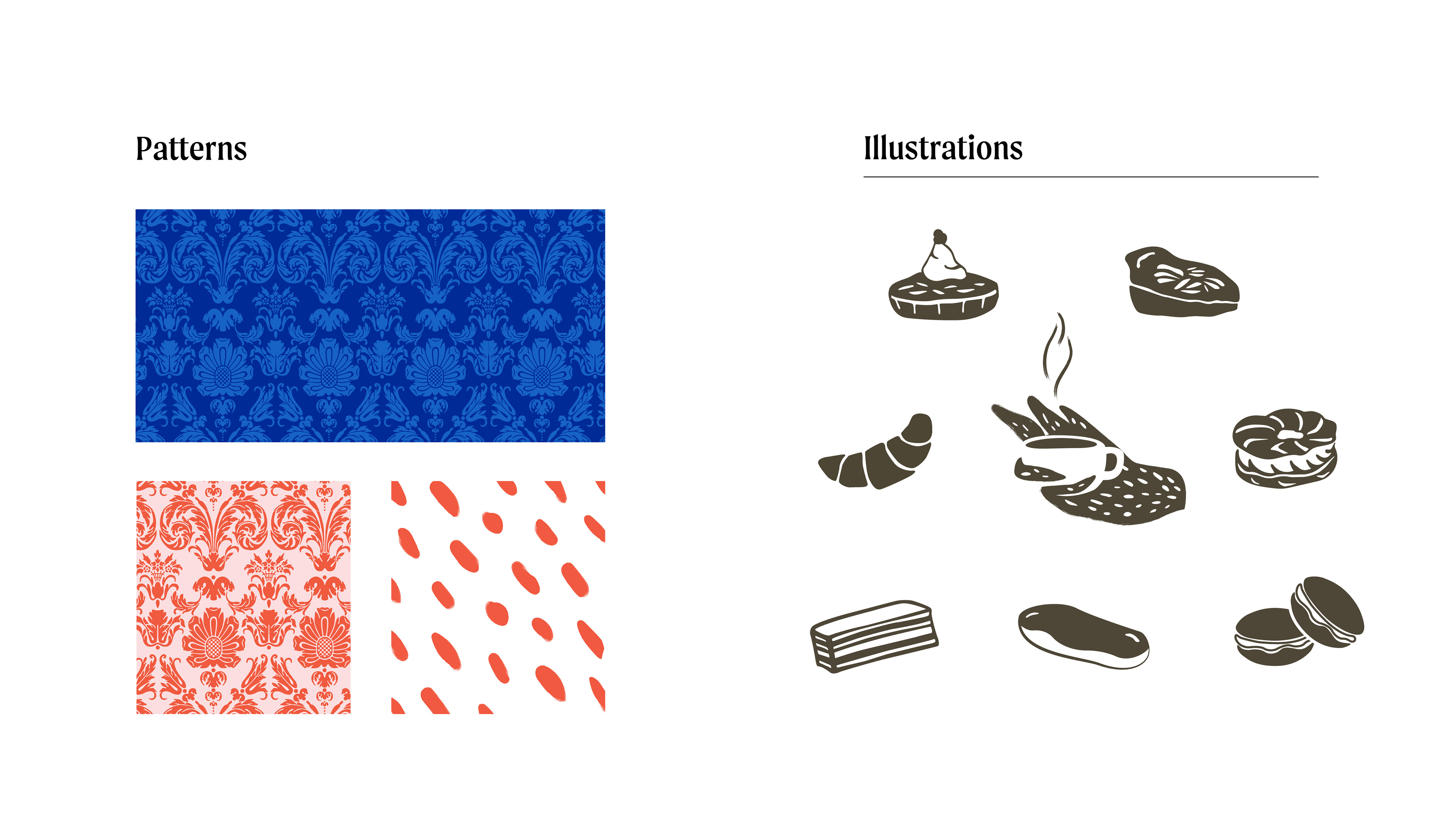
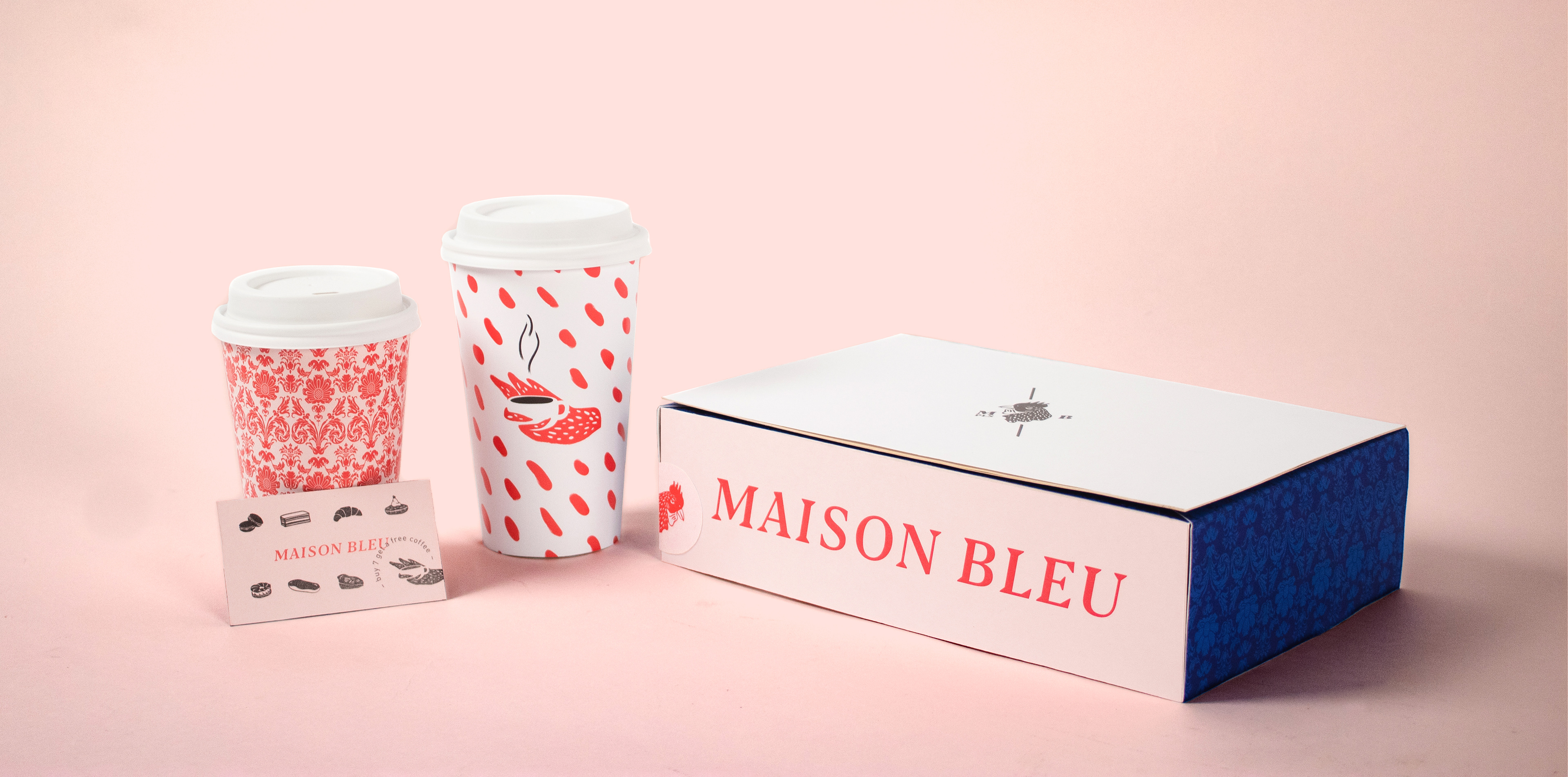
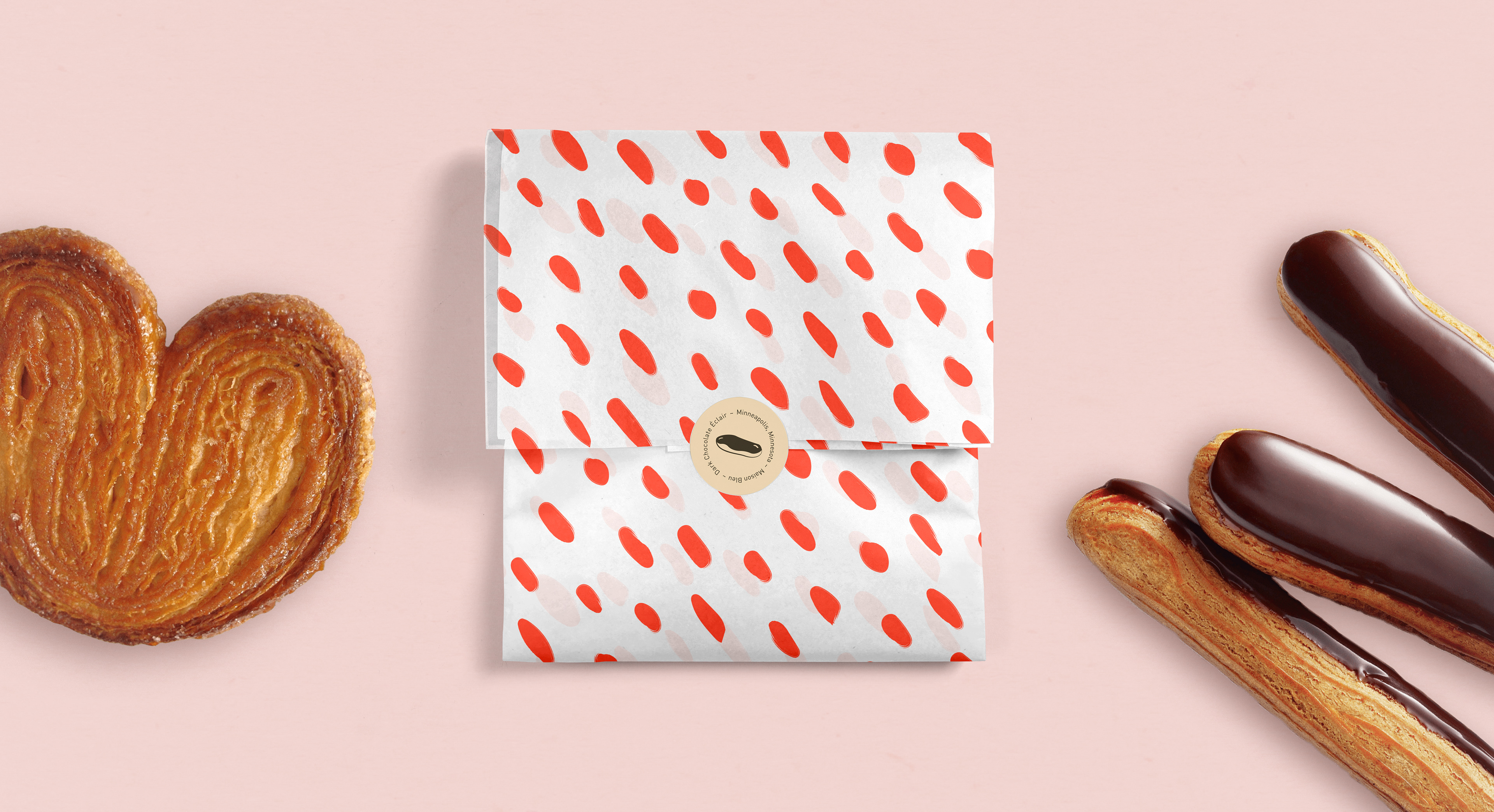
The colors, brutalist style, patterns and illustrations all work together to create a fun, welcoming, and slightly outré atmosphere. Maison Bleu embodies an American celebration of French culture and provides traditional pastries with all the visual embellishment they deserve.