S.T. Biologicals
Guided a regenerative agriculture company through a complete rebrand and packaging extension.
ROLE: Branding, packaging design, advertisement and collateral design
Contributors: Jayne Carlson, John Altenbernd
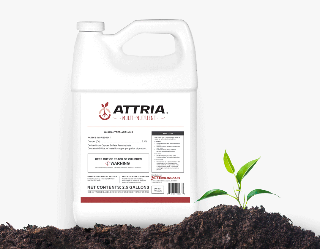
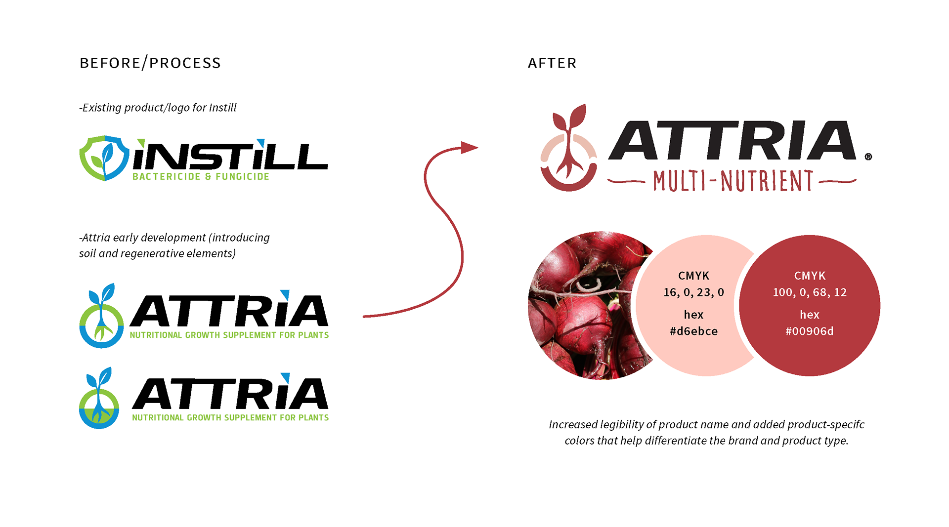
The client, S.T. Biologicals needed me to design a logo for a new product, Attria in the same style as one of their existing logos, Instill. The Instill logo wasn't well designed for what the product is and who it is being marketed to, so I decided to deviate from that but still maintain some of the original typography elements and presence of the leaf.
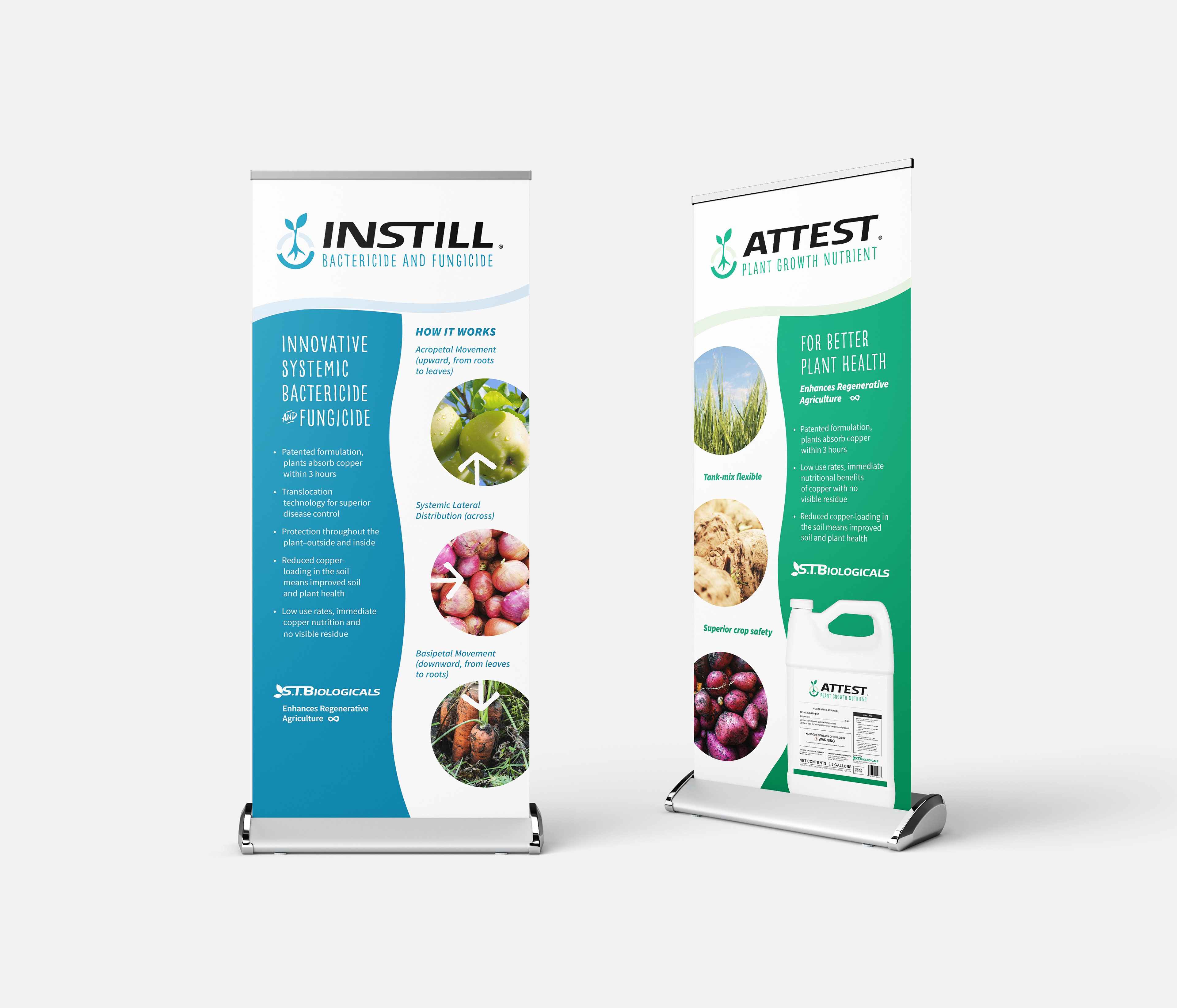
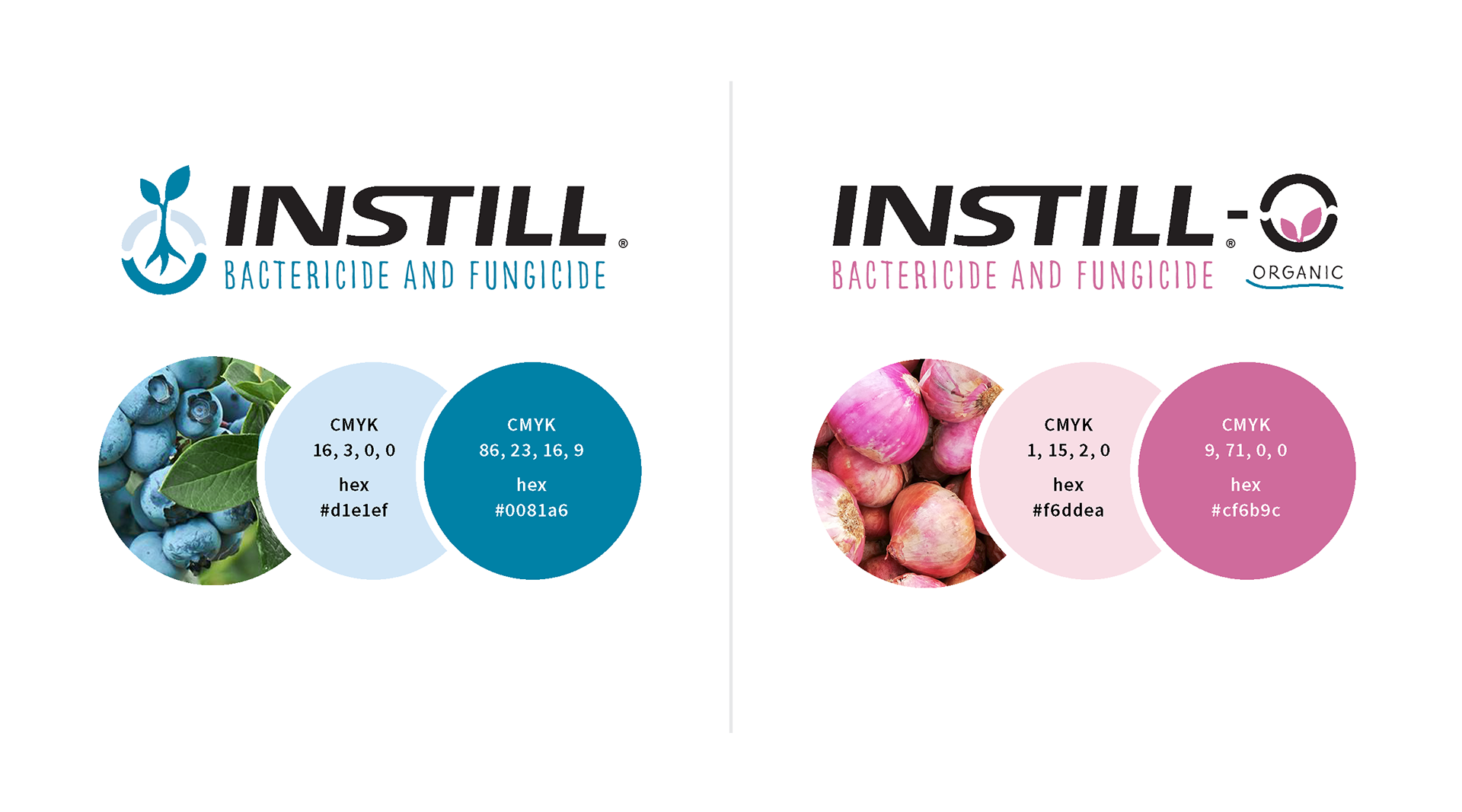
They liked the Attria logo so much, that they decided to have me redesign Instill and Attest pre-existing) and design logos for new products: Instill and Attest (organic). In the ag industry, differentiating organic from non-organic is just as important as differentiating product functions. To make it easy for them to keep track of and distinguish products, I use very different colors based on some of the crops the product would be used for.

Before doing the packaging design for the products, I educated them on the importance of brand consistency and convinced them to rebrand their company logo to match the products so that they can have a more recognizable brand.